


This map is based upon Prominence and Isolation data from Peakbagger and Eberhard Jurgalski’s work on Dominance. The icons are color-coded by their Altitude Class (Dominance). Each summit is linked to its Prominence Key-Col (horse icon) by a purple line and has a separate orange line drawn to its ILP (Isolation Limit Point).
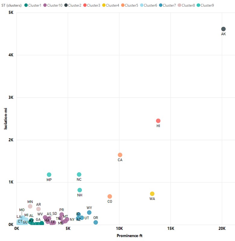
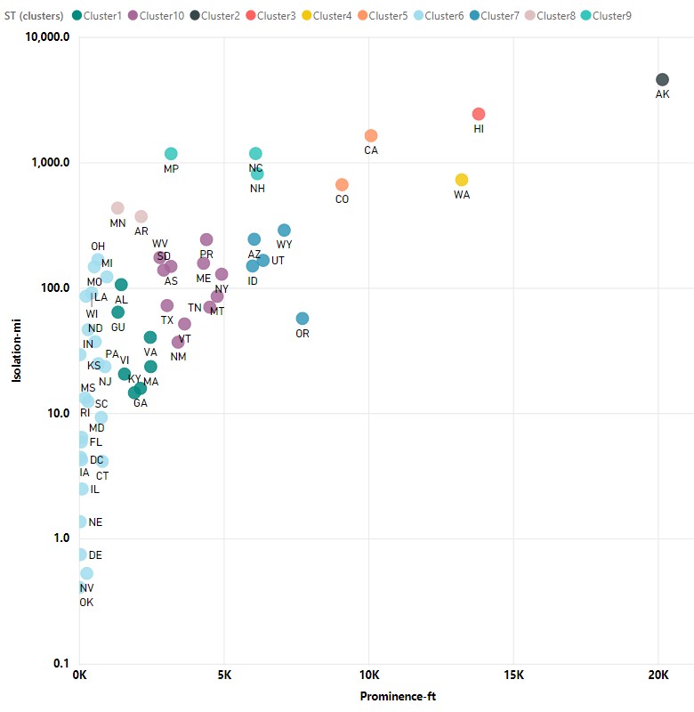
These two scatter plots show the Prominence height versus the Isolation distance in linear (left) and log (right – for better readability) scales. I then ran a clustering algorithm to form clusters of peaks which are color-coded in the table below.
This table presents other measures used to quantify summits:
- Prom – Prominence is the vertical distance between peak and key col
- Iso – Isolation is the radius of dominance
- Dom – Dominance as defined by Eberhard Jurgalski
Table coming soon…
* – Note that Connecticut doesn’t have prominence or isolation because it is a contour line on the side of Mt Frissell. Thus these measures have no meaning.
Edward Earl, over at COHP, has produced this map showing each state’s highpoint (HP), most prominent point (PP) and distance isolation point (IP). Please click on the map to see the map’s legend.