This map is based upon the work of Dr. Thomas Martin and his classification of the 50 State summits. The icons are color-coded by their Martin Classification and have three arms representing the Gain and round-trip Distance.
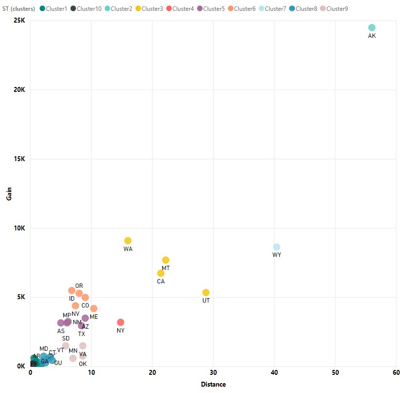
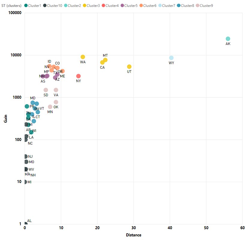
These two scatter plots show the Gain versus the Hiking Distance in linear (left) and log (right – for better readability) scales. I then ran a clustering algorithm to form clusters of peaks which are color-coded in the table below. These clusters are slightly different than those of the Martin Classification.


People are always curious about “How hard is it?”. This table presents the highpoints with various “difficulty” measures:
- YDS – Yosemite Decimal System is mostly a technical climbing rating system
- COHP – COHP Class Ratings is mostly a technical climbing rating system
- Martin – Martin Classification based upon elevation gain and distance hiked
- Gain – Total vertical gain in feet on the “standard” (easiest) route
- Dist – Round-trip distance (trailhead to summit) in miles on the “standard” (easiest) route
Table coming soon…


